
Building #3
Building #3
The original challenge was to find an unseen building ...

At end of the previous post on Building #2, I set myself the challenge of finding a building I didn’t even know existed. The aim was to become passionate about it so that I could create a new post for Building #3.
In retrospect this wasn’t going to be a straightforward task. Where to even start? After sifting through many images using internet search tools, it seems the initial exercise needed a rethink and a decision to compromise; the task therefore changed to find a building I knew vaguely and explaining why it’s a candidate for a blog post. This means defining my architectural preferences.
What do I enjoy about buildings? Any immediate visual symmetry, usually seen from the front or main design elevation. See below this highly pleasing photograph by Steve Bryant which captures building symmetry well for me - both in terms of the arches themselves and their repeating pattern into the distance.
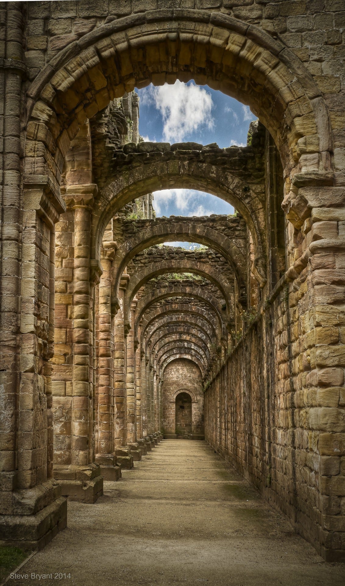
The whole building doesn’t need to be symmetrical, in deed a little asymmetry can create more interest. At the end of the structure in the photograph sits a slighlty off-centre doorway - not by much, but enough to tease the brain. This happens often in the layout or plan of a building, particularly if it consists of more than one block, as in the below photograph by Jean Beaufort of the Palace of Westminster, one of my favourite buildings.

There’s symmetry going on but it’s not perfect. It makes one ask who decided on the number of towers and why the different heights and shapes? Why was Westminster Hall (the large vaulted roof to the left of ‘Big Ben’ or the Elizabeth Tower as it is properly know) kept when it clearly comes from a different architectural era? Why the use of a somewhat contrived Elizabethan style to clad the facades of a classical symmetrical structure?
What would be my ideal choice of symmetrical building to feature in this post? I prefer them historicist but not too decorative. So here’s a picture of a bank building in a smallish Italian town not far from Venice. It was taken while on holiday there last summer; as soon as I saw the building it stirred a passion inside me and I wanted to capture the image. I felt no need to go inside and perhaps even doing that would reduce the pleasure. The matrix nature of the symmetry is fascinating when looking at the windows both vertically and horizontally; and then at the small projections from the first floor window frames that reflect the Italianate tooth-like cornice at the top. Why are there gaps in the spacing of windows on the right and left sides of the facade? The two doorways one above the other, the difference in styling of the first floor windows, the downpipe and electrics box on the left end, these all create some asymmetry which increases the appeal of the image for me.
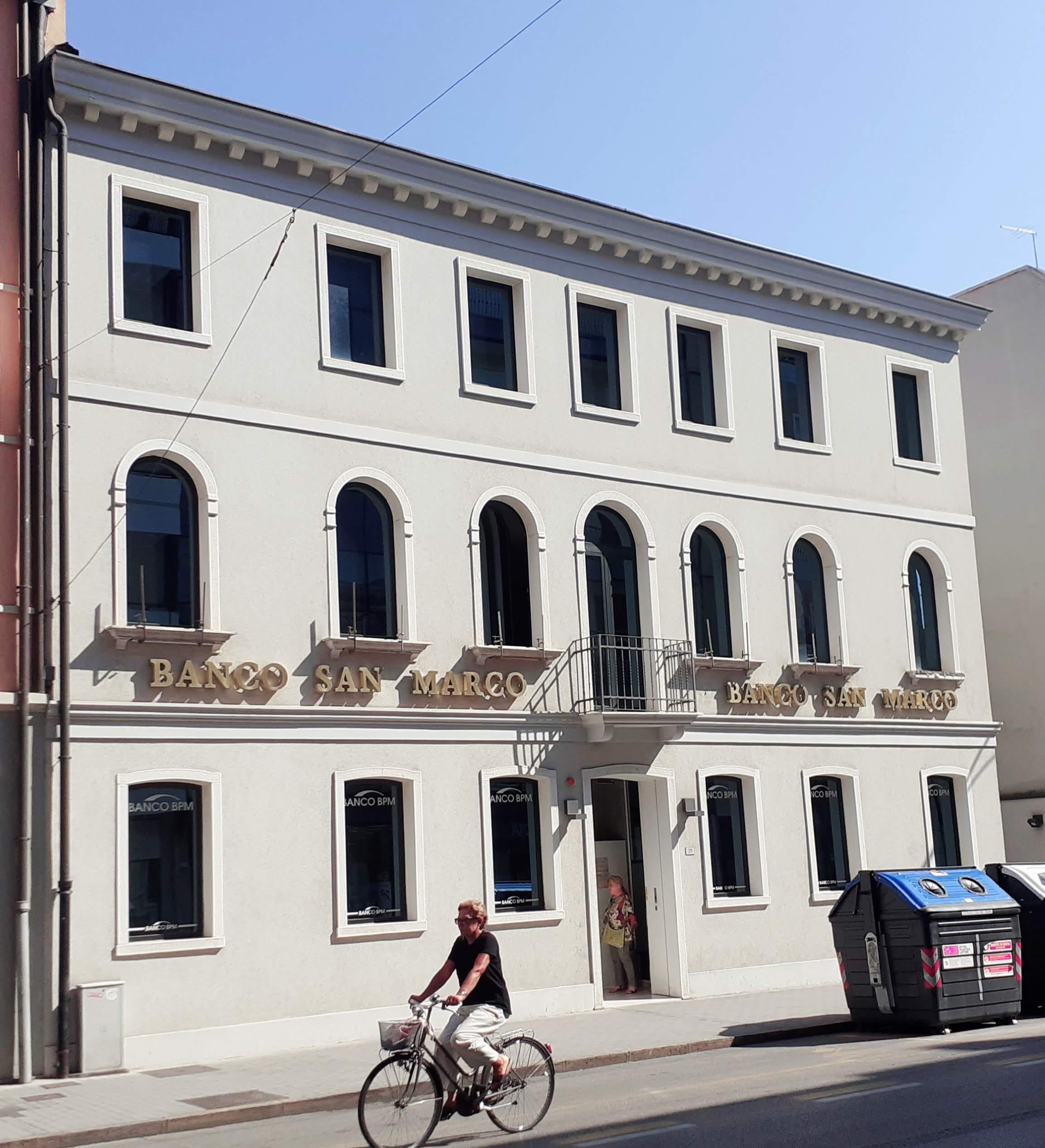
It would be interesting to know what you think of Building #3. Does it stir any feelings within you or is it simply a bank? Would you want to live in it if it were adapted for accommodation purposes? Would you prefer something much more symmetrical and much less decorative such as a Modernist house or skyscraper?
I do like that bank building - it looks like it belongs in a Hopper painting.